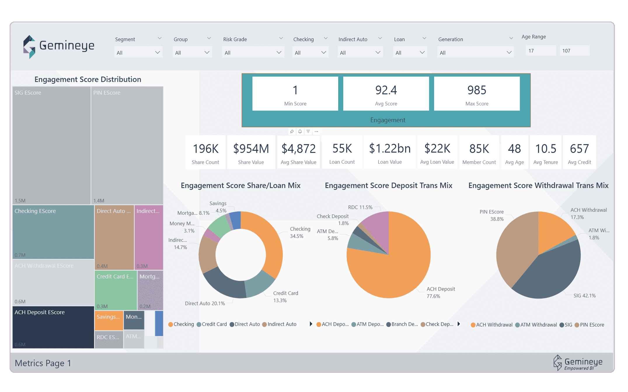
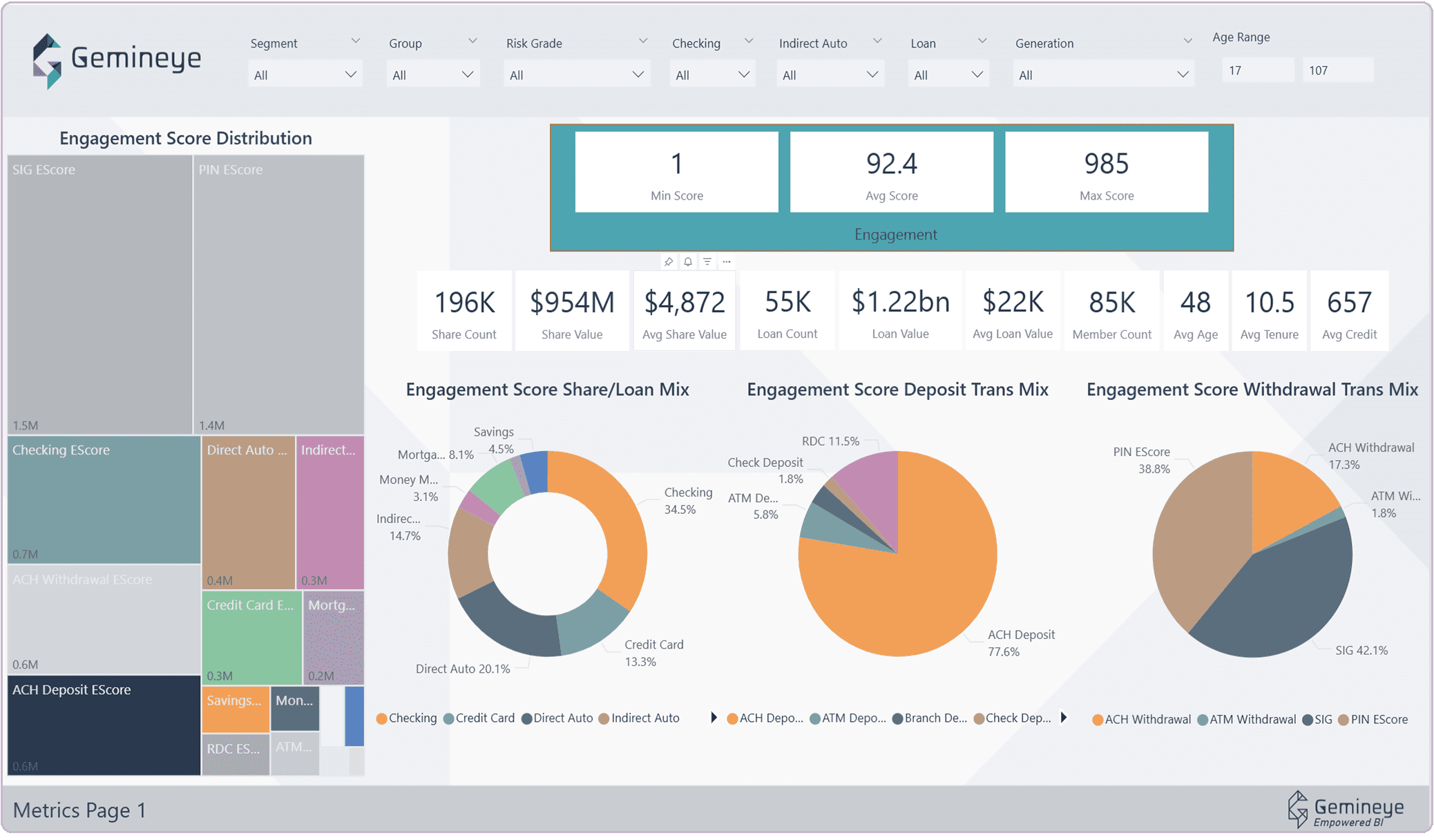
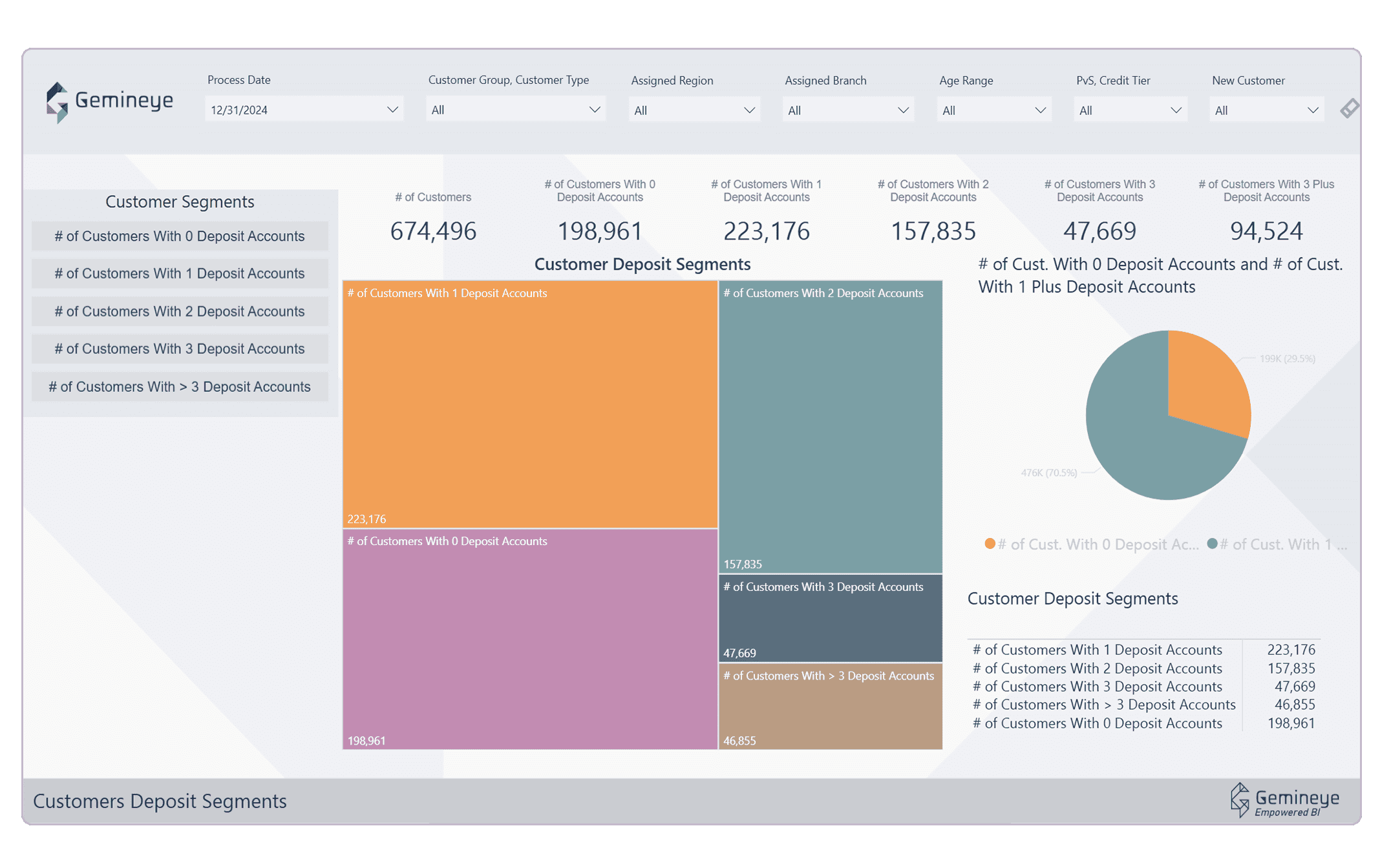
Advanced insights out of the box
With over 250 visualizations available out of the box, day one of Gemineye gives your team – technical and non-technical alike – an immense number of reports and dashboards to consume.





Welcome to our very first edition of “A Day in the Life of a Data Analyst,” featuring the equally talented and down-to-earth Ann Ditlow, Data Analyst at 4Front CU. Ann ...
The team at Gemineye is excited to announce their five-year anniversary with Quorum Federal Credit Union, a $1.1B organization headquartered in Purchase, NY. Quorum is an entirely-online credit union with ...
Gemineye (formerly The Knowlton Group) has partnered with Databricks, the world’s leading data and AI company. Gemineye’s innovative data analytics architecture, called the Gemineye Data Lakehouse, is run entirely ...






Sandwich, Mass (September 11th, 2026) – If you know credit unions, you know how often they prioritize community impact, and analytics provider Gemineye is thrilled to be a part of these efforts by partnering with their client $1.6B, Michigan-based Financial Plus Credit Union (FPCU) to deliver an incredible experience for the next generation of technology professionals. As part of FPCU’s strategic partnership with Kettering University, Kettering Co-op students have the opportunity to gain hands-on, real-world experience while working alongside FPCU’s team. Unlike a traditional internship, Kettering’s Co-op program is an immersive part of the students’ education, combining alternating academic and full-time paid Co-op terms throughout their entire time at the university. FPCU’s Co-op students work alongside professionals, gaining meaningful experience in their fields while contributing to projects that have a real impact on the organization. In the Spring 2026 semester, FPCU and Gemineye collaborated to take that experience to the next level. Maggie Chopp, Director of Business Development at Gemineye said, “Credit unions are often incredible doors to opportunity for young professionals to grow in a hands-on environment – I know from my own experience starting out in credit unions. FPCU’s ongoing commitment to bringing the best educational opportunities possible to the Kettering University Co-Op students is great example of the educational impact CUs can make. And by partnering with Gemineye, they were able to further develop these valuable STEM experiences.” While the Co-op experience was designed to help the students grow, the benefits extended to FPCU also, as Gemineye was able to help FPCU improve their reporting infrastructure concurrently. The updated dashboard gave the IT team a more effective tool for understanding and managing its workload. Meredith Baaki, Director of Innovation & Product Management at FPCU explained, “Great dashboards don’t answer every question. They answer the right questions. Because Gemineye took the time to clearly define our goals and the decisions we needed to support, we were able to transform raw ticket data into meaningful insights. The dashboard gives us a clear view of team capacity, workload, and demand, creating alignment across the organization and helping us make better decisions about where to focus next.” As a credit union and community bank-specific analytics provider, Gemineye enthusiastically supports the credit union mission of people helping people. This partnership with FPCU and the Kettering University students was a natural fit for both teams to shine. “Credit union leaders often have similar origin stories as students, interns or entry level positions – so I think it’s easy for our audience to appreciate the emphasis we put on education” explains Gemineye’s Maggie Chopp. “We honored to be a part of the ‘people helping people’ philosophy.” To read FPCU’s full case study, including before-and-after dashboards, click here. About Financial Plus Credit Union Since 1952, Financial Plus has been putting today’s needs and tomorrow’s dreams all within reach. Owned by over 83,000 members with more than $1.7 billion in assets, the credit union provides a full range of modern, easily accessible banking products and services to all throughout the state of Michigan. For more information, visit www.myfpcu.com or call (800) 748-0451. See Gemineye’s Full Suite of Solutions Interested in learning how the Gemineye Data Lakehouse can support your dashboard and reporting needs like Financial Plus CU? Browse the solutions we solve and business teams we help.

Two branches, 20 minutes apart, same products, similar size. One is thriving. The other is quietly slipping. The numbers that explain why are sitting in 4 different systems, and nobody has put them side by side. This is the situation at most credit unions and community banks. The branch network generates an enormous amount of data every day, on foot traffic, staffing, new accounts, product mix, service times, and member satisfaction. But that data lives in separate systems, gets compiled by hand once a month if at all, and rarely arrives in time or in a form that helps a leader actually manage a branch. The result is that branch decisions get made on instinct and anecdote, when the evidence to make them well already exists. The institutions pulling ahead are the ones that have stopped guessing. They have connected their branch data, made it visible, and turned it into a tool for managing performance branch by branch. Here is what that looks like in practice. Spot a Struggling Branch Before the Quarter Ends Go back to those two branches. The one that is slipping did not fail overnight. The early signals (a slow decline in new accounts, longer wait times, a drop in a key product line) were present for months. They simply were not visible to anyone in a position to act, because the data that showed them was scattered and stale. When branch data is connected and current, those signals surface while there is still time to respond. A leader can see that one location’s new-account growth has flattened relative to the others, look into why, and intervene, rather than discovering the problem in a quarterly report when three months of ground has already been lost. The point is not the dashboard itself. It is the shift from finding out too late to seeing it as it happens. Match Staffing to What Each Branch Actually Needs Branch staffing is one of the largest controllable costs a credit union carries, and human resource expenses are typically a credit union’s single largest operating cost, as Callahan & Associates notes in its performance benchmarking guidance. Yet staffing decisions are often made on rough averages rather than on what each branch actually experiences. One location is overstaffed during quiet midweek mornings while another has members waiting in line every Friday afternoon. Branch-level data on traffic patterns, transaction volume, and service times turns staffing from a guess into a plan. Leaders can align hours and personnel to the real rhythm of each location, reducing the cost of idle capacity at one branch and the service failures of an understaffed one. The same data reveals which branches are genuinely productive on a members-per-employee basis and which are carrying more cost than their activity justifies. See Which Branches Are Growing Relationships, Not Just Transactions A branch that processes a high volume of transactions is busy. That is not the same as a branch that is deepening member relationships. The difference shows up in product penetration: how many products the average member at a given branch actually uses. A branch can look active while quietly failing to grow the relationships that drive long-term value. When leaders can compare product penetration and onboarding success across branches, the picture sharpens considerably. A location with strong new-member growth but weak product adoption has a clear, addressable opportunity. A branch where new members are activating multiple products is doing something worth understanding and replicating. These are the granular, specific insights that turn a vague sense of how a branch is doing into a concrete plan for improving it. Replace Anecdote With Evidence in Branch Decisions The deeper shift is cultural. When branch data is hard to get, decisions default to opinion, the loudest voice, the most recent complaint, or a manager’s gut feeling. When the data is visible and trusted, the conversation changes. This is exactly the shift P1FCU in Idaho made by using Gemineye’s analytics platform to generate insights on branch activity. The institution moved away from anecdotal evidence, opinion, and reliance on spreadsheets, and toward decisions grounded in clear operational data. That is the real value of branch analytics: not prettier reports, but better decisions, made with confidence, by people who can finally see what is happening across their network. Give Every Branch the Data to Perform Optimizing branch performance depends on bringing scattered branch data together and making it visible to the people who run the network. Gemineye’s Operations solution connects the systems behind your branches and delivers detailed daily reporting, so leaders can see traffic and staffing patterns, product penetration, and onboarding success across every location, not once a month, but as it happens. The two branches twenty minutes apart stop being a mystery. See how Gemineye helps credit unions and community banks turn branch data into branch performance. One small consistency note: the opening italic line uses “20 minutes” and “4 different systems” (numerals), while the closing line says “twenty minutes apart” (spelled out). Worth standardizing to whichever style the client prefers before publishing.
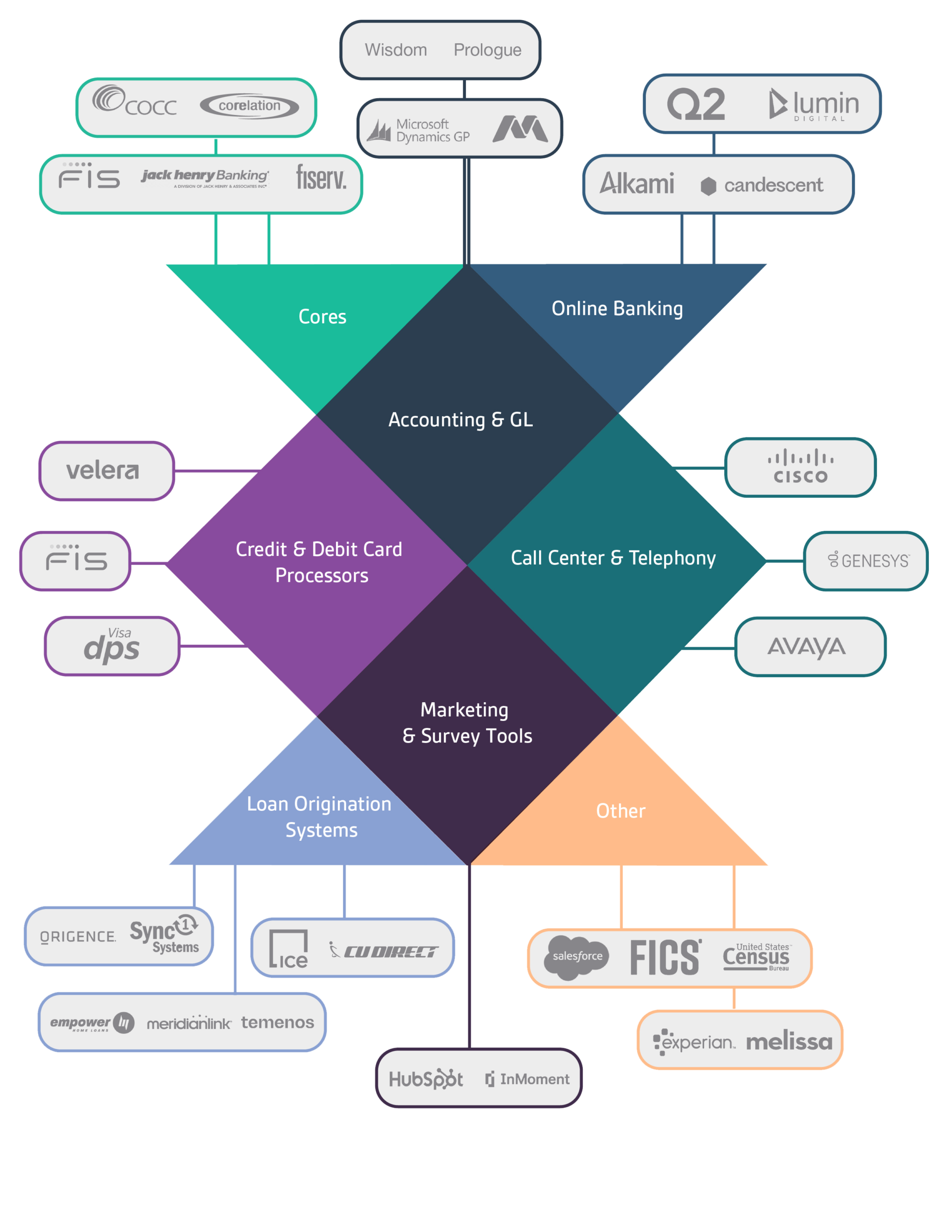
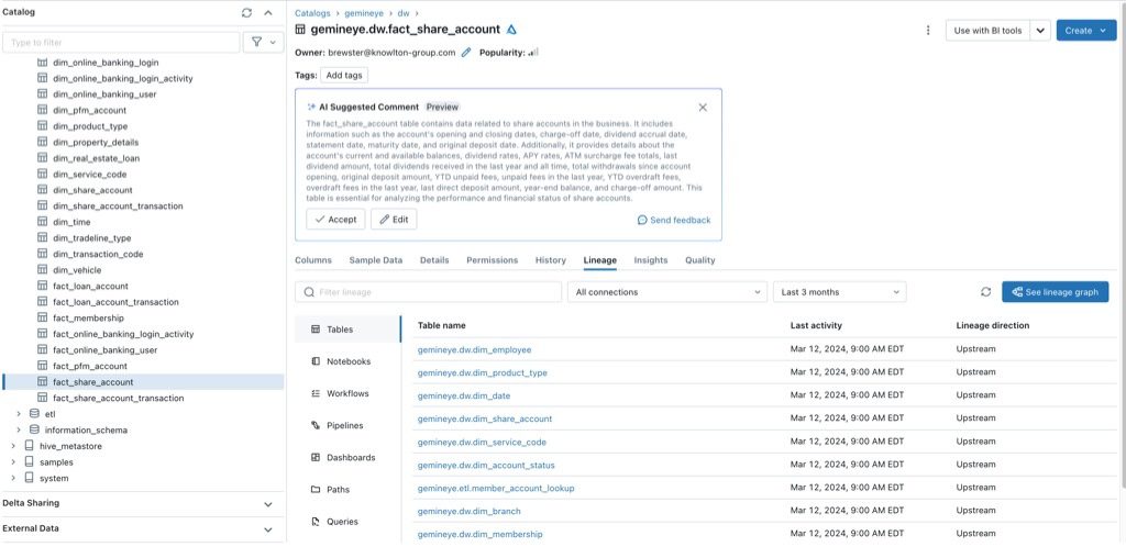
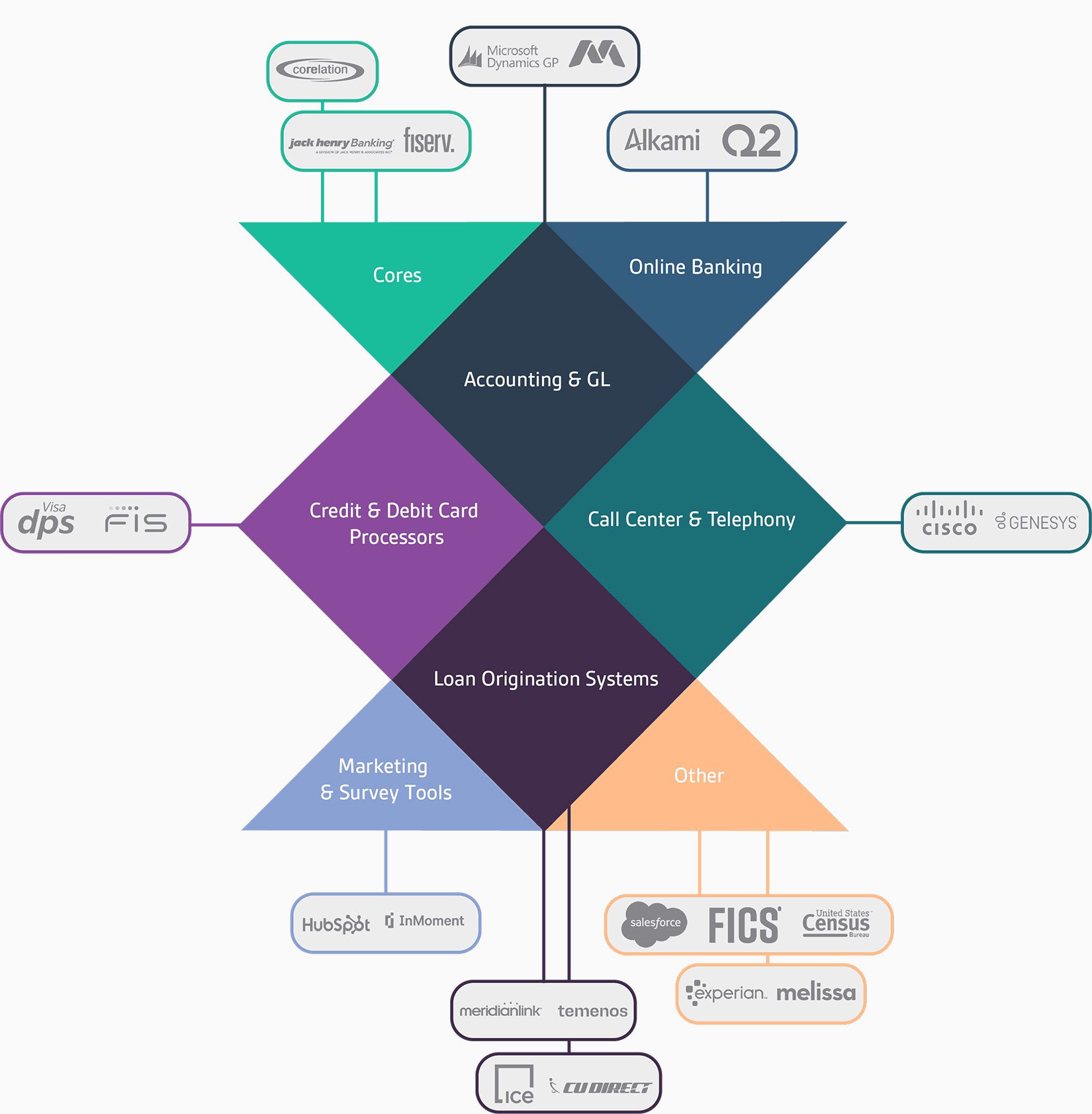
If you have ever tried to get clean, analysis-ready data out of your core banking system, you know the gap between how simple integration sounds and how hard it actually is. The core holds the transactional heart of your institution, but it was built to run banking operations, not to hand its data to an analytics platform in a usable form. Anyone who has worked with a Symitar, Corelation, or Fiserv core knows that connecting it to everything else is where data projects quietly get stuck. This is a shared reality across the industry. These platforms dominate the market for both institution types: Federal Reserve research notes that each of the major core providers serves both banks and credit unions, with Fiserv, Jack Henry, and FIS together serving the large majority of institutions. Whether you run a credit union on Symitar or a community bank on a Fiserv platform, the integration challenge is fundamentally the same, and understanding what it really involves is the first step to solving it well. Why Core Systems Are So Hard to Pull Data From Core banking systems were designed decades ago to do one thing extremely well: process and record transactions reliably. Analytics was not part of the original brief. The data inside a core is structured for operational processing, not for analysis, which means it often arrives in formats that are dense, cryptic, and far from ready to drop into a report. A core may expose its data through nightly batch files, proprietary formats, or interfaces that require specific knowledge to navigate. Field names are not always intuitive. The same concept may be represented differently than it is in your loan origination or digital banking systems. Getting from what the core stores to what an analyst can actually use requires translation, and that translation is where most of the real work of integration lives. Every System Speaks a Different Language The core is only one source. A complete picture of your institution requires combining it with loan origination, digital banking, your CRM, card processing, and often a handful of third-party services. Each of these systems structures its data differently and defines its terms in its own way. A member or customer identifier in one system may not match the identifier in another. An account status may be coded one way in the core and another way in digital banking. Integration is not just moving data from these systems into one place. It is reconciling all of these differences so that when the data comes together, it actually agrees. Without that reconciliation, you do not have integrated data. You have a pile of conflicting exports that take just as long to make sense of as they did when they were separate. This is the part of integration that platforms promising easy connectivity tend to gloss over, and it is the part that determines whether the result is trustworthy. The Maintenance Burden Nobody Warns You About Even once a connection is built and the data is reconciled, the work is not finished. Core systems change. Vendors push updates, file formats shift, fields get added or deprecated, and digital banking platforms evolve. Every one of these changes can break a custom integration, and a broken integration means a report that is silently wrong or a pipeline that quietly stops running. For a lean data team, this ongoing maintenance is a serious and often underestimated cost. A custom integration is not a one-time build. It is a standing commitment to monitor, test, and repair connections indefinitely. The institutions that struggle most with integration are often the ones that budgeted for the initial project but not for the years of upkeep that follow. Understanding this up front changes how you evaluate any integration approach. Why Pre-Built, Maintained Integrations Change the Equation This is the difference between building integration yourself and using a platform that has already done it. A pre-built integration to a Symitar, Corelation, or Fiserv core system means the hard work of translating that specific core’s data has already been done, tested against real institutions, and is kept current as the source system changes. Your team inherits a working connection rather than a project. The value compounds across every system you need to connect. When the integrations to your core, your loan origination system, your digital banking platform, and your third-party services are all pre-built and maintained, the reconciliation work that would otherwise consume your team is handled. What is left is the analysis, which is the work you actually want your people doing. The breadth and depth of an integration library, and specifically whether it includes the difficult core and ancillary systems your institution runs, is the single biggest factor in how much of this burden you carry versus how much is lifted for you. Connect Your Core Without the Custom-Build Burden Gemineye’s Data Integrations solution is built around the reality of these systems, and its capabilities are considered best-in-class. It offers pre-built integrations to the core platforms credit unions and community banks actually run, including Symitar, Corelation, and Fiserv systems, along with loan and mortgage origination, digital banking, CRM, and third-party data vendors. Because these connections are already built and maintained, your team avoids both the custom-build project and the perpetual maintenance burden that follows it. The platform also provides end-to-end data lineage and a transparent data dictionary, so your team can trace exactly how every field moves from the core to a finished report, and keep control over how your data is defined. If getting clean, analysis-ready data out of your core has been the bottleneck, see how Gemineye’s Data Integrations solution handles the hard part for you.